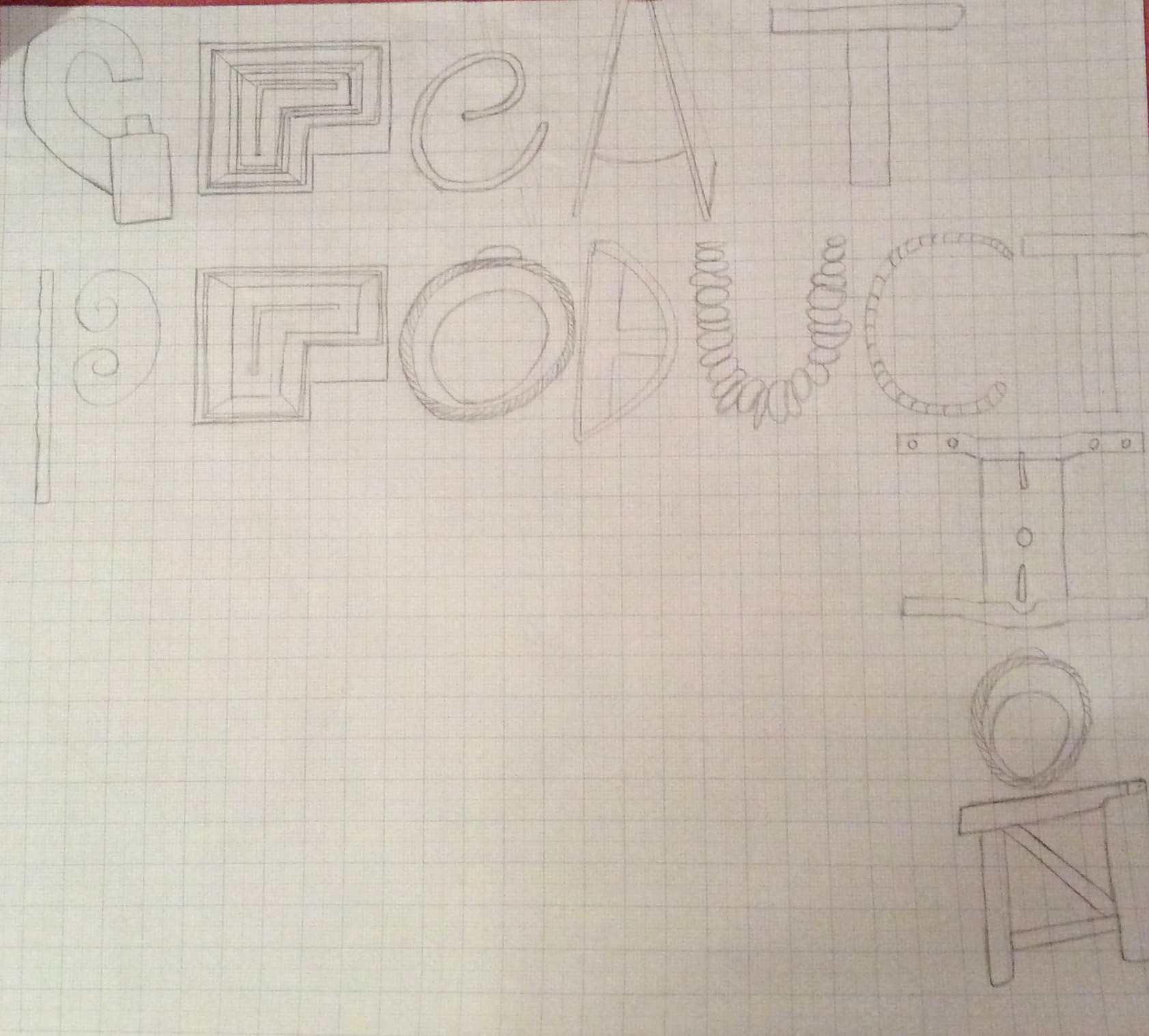
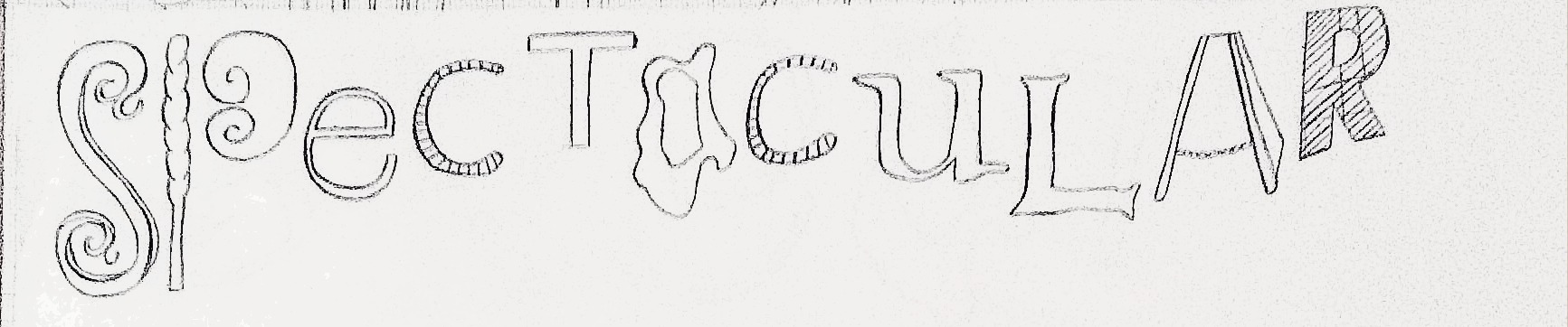
As part of the preparation project I had to document a journey, this included taking pictures of existing typeface on shops, signs etc and finding letter forms (objects that look like letters). I then had to trace these letters to form quotes I had found about my place, which was Guildford. Here are my typographic pieces:
‘Great production’ – Yvonne Arnaud, Guildford – I used a mix of letterforms and typeface to create this on grid paper– This was said about Guildford Cathedral. I like the way that I have sharp lines in comparison to the ‘Great production’ typography which makes it more legible.– ‘Guildford Castle’ – Here I drew a grid on the paper which I then drew the word on and erased the grid in the background. I feel that this is a bit too mismatched due to the mix of upper and lower case, however I like the grid effect.This was a quote about Guildford Spectrum. I used existing typeface to create this and I feel that the fonts I selected reflect the quote.
I think that these could have been improved in terms of composition. For example, ‘Great Productions’ did not fit on one line and so had to improvise by bending the word round the page which I think makes it harder to read. I also think that the compositions where I used fineliner were sharper and clearer to read.